Senior User Researcher with over 8 years of experience, adept at leveraging design thinking and agile methodologies to drive user-centric product innovation. Demonstrates expertise in usability testing and experience mapping, translating complex insights into strategic actions that enhance product engagement. Committed to fostering team development and aligning research roadmaps with business objectives for measurable success.
Senior User Researcher with over 8 years of experience, adept at leveraging design thinking and agile methodologies to drive user-centric product innovation.
Research - Design - Testing
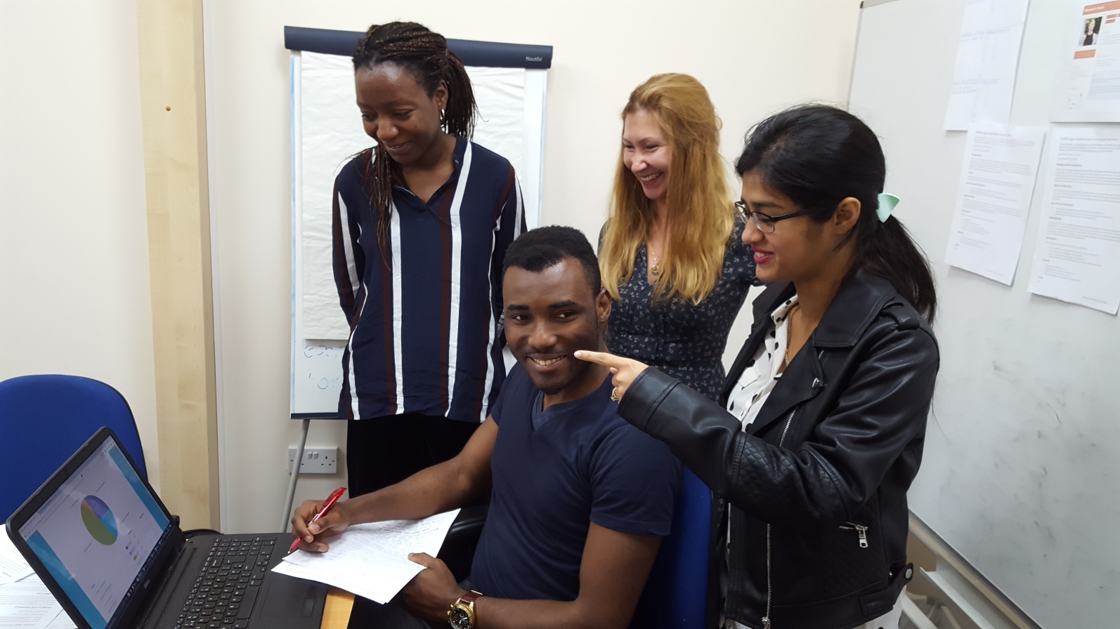

Status: In Development
Time to Prototyping: 8 weeks
Co-Designers: Olesya Ma, Ann Oduwaiye, Naman Varma, Penny Hung
The team at YMV Tech, a digital agency in London, was tasked with developing a hair & beauty salon app from scratch for a startup client. The proposal intended to have it available for iOS and Android smartphones so a strategic approach was taken to design for the iOS at first and make a blueprint from it for the Android version.
The team size was 9 including myself as the UX Lead and Product Manager, 4 Junior UX Designers (co-located), 2 Visual Designers and 2 Developers (remote). The project adopted an Agile approach through 3 distinct phases of product discovery, design and development.
The UX design process iteratively involved:
The team employed the following techniques to accomplish the aforementioned process:
We used the following tools to aid our work for efficiency, better communication and collaboration with stakeholders:
The discovery stage kicked off with interviewing the project client as a key stakeholder to elicit product requirements, capture and understand their idea, needs and concerns. This led to the creation of the Requirement Document which served as a living document to guide the team and keep other stakeholders in the loop.
Following a product brief, we decided to gain a good understanding of the industry and seek to fill our knowledge gap the fastest means possible by way of competitive analysis. The technique provided us with market research data by helping to identify the market segmentation, competitors - direct & indirect, the key players, their strengths and weaknesses, and then enabling us to uncover opportunity gaps.
Partially equipped with the research findings obtained from the competitive analysis by synthesizing the data into unmet needs and key questions, individual preconceptions and new assumptions were triggered within the team about the beauty industry.
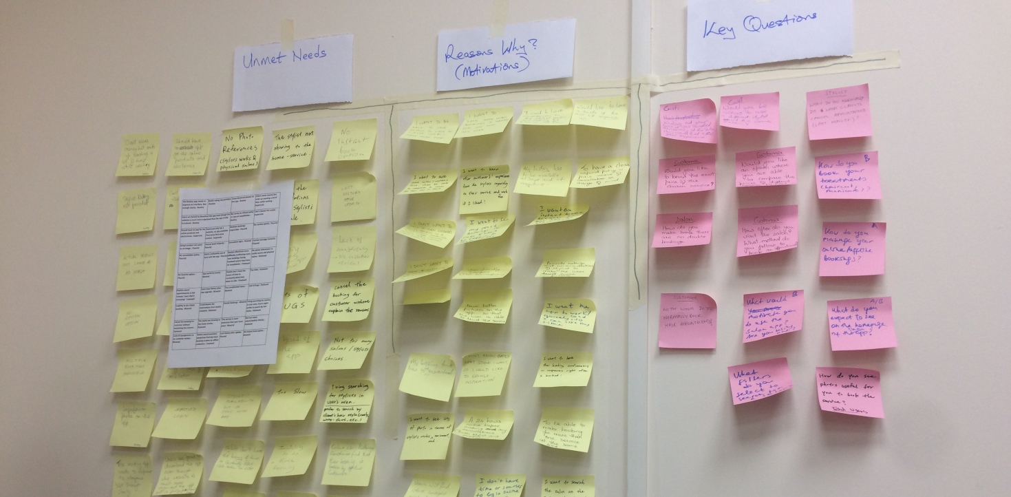
Some of the hypotheses generated at the time were:
The need to validate these assumptions was crucial while at the same time we were faced with very limited resources such as time and budget, so it was important to put the available resources to effective use. We thought research was required and a tactical decision was made to apply a qualitative method to researching the vendor-users (service providers) being a subset of the target audience, and a quantitative method by survey to gain insightful data from the client-users (salon customers) as the other audience subset.
I drafted two different research plans to study the vendors (qualitative) and the clients (quantitative) with the formulation of 3 research questions for each methods which would later aid formulating more sets of sub questions to research the participants with.
Research Method 1 > The Vendor-User Interview Key Questions:
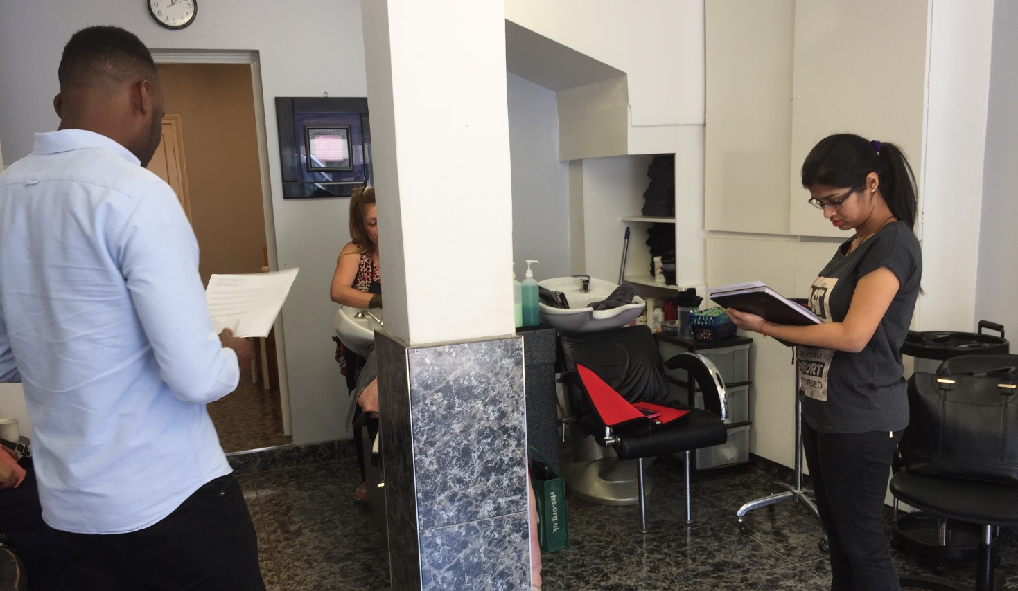
Our main goal with the vendor research objectives was to understand possible incentives to engage and empower stylists more.
Research Method 2 > The Client-User Survey Key Questions:
Both research methods gave us further insights about the industry as well as the stakeholders, thus enabling us to validate and invalidate our initial assumptions that formed the research hypotheses. For example, we could uncover that the industry has many undocumented migrants as independent stylists who might perceive an app tailored for them differently or useless with the assumption that attaching a bank account and paying tax would be a necessity. We could also invalidate the assumption that all stylists or salon would be readily willing to offer deals for increased business. The customer survey on the other hand revealed to us that majority of people will be more inclined to change salon or stylist based on recommendations, convenience to home or work, and pricing. Also people usually book hair or beauty services over the phone.
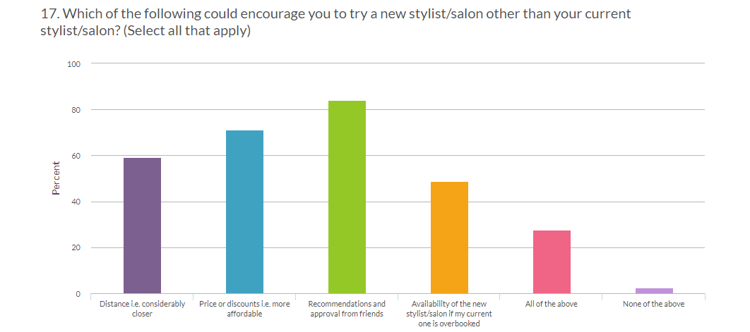
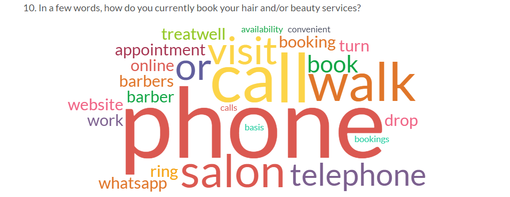
Although insightful, the survey finding has low confidence level considering the small size of respondents (under 100) surveyed.
The research findings also informed our opinions about the user demographics, their archetypes, motivations, pains and frustrations which we fed into the personas. Initially, as many as 6 different personas were profiled but as the product strategy and design direction became clearer, it was important to design around as few personas as possible to eliminate value ambiguity, so we reduced the personas to 3 distinct user subsets which became our primary personas, and a secondary fourth persona.
The primary personas include:
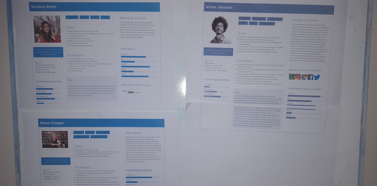
The personas enabled us to identify who our core users would be, then humanize and empathise with them rather than design a product for everyone as customers or all salon operators as vendors. It didn't take long before these personas became the subject of everyday conversation within the team. Not only did I advise team members to develop a persona each, I also oversaw the fusion and later assigned an ambassador to each of the final personas while I managed them (ambassadors). This helped to ensure that each persona was well represented during any decision making process.
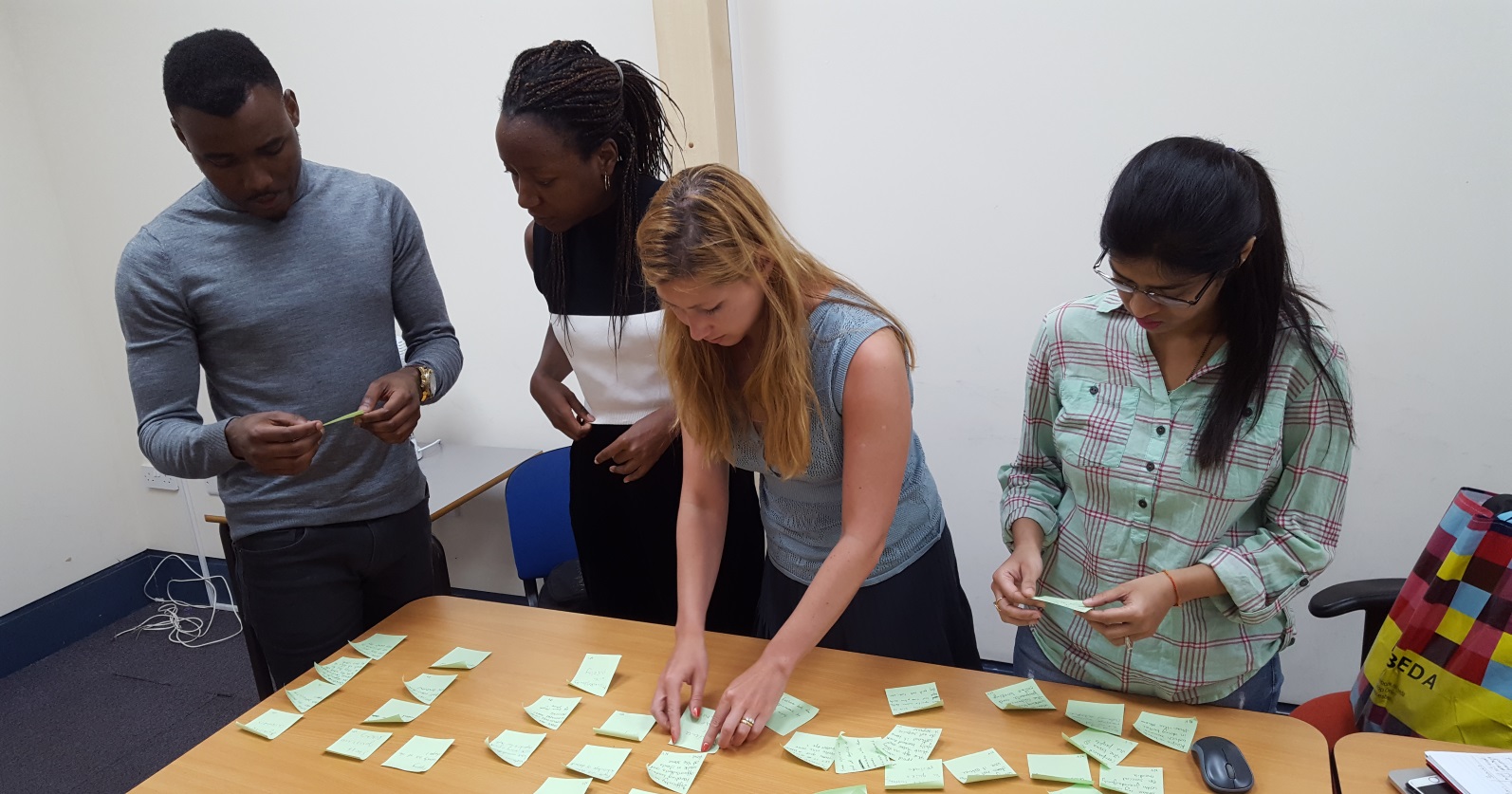
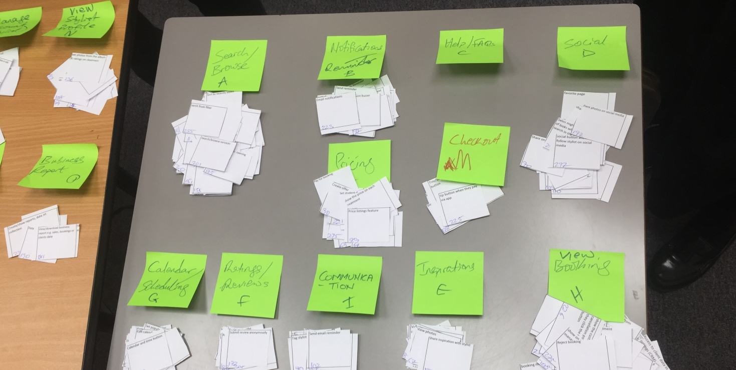
Synthesizing the research data further, I led the team from generating user stories to conducting workshops on affinity diagram to map user pain points, questions, motivations and expectations based on the relationships between data sets. This aided our requirement gathering by extracting tasks that would enable users reach their goals efficiently and effectively, then futher pre-sorting, by method of card sorting, the tasks into related categories to ensure we design an intuitive system that supports findability and easy access to resources relevant to the user.
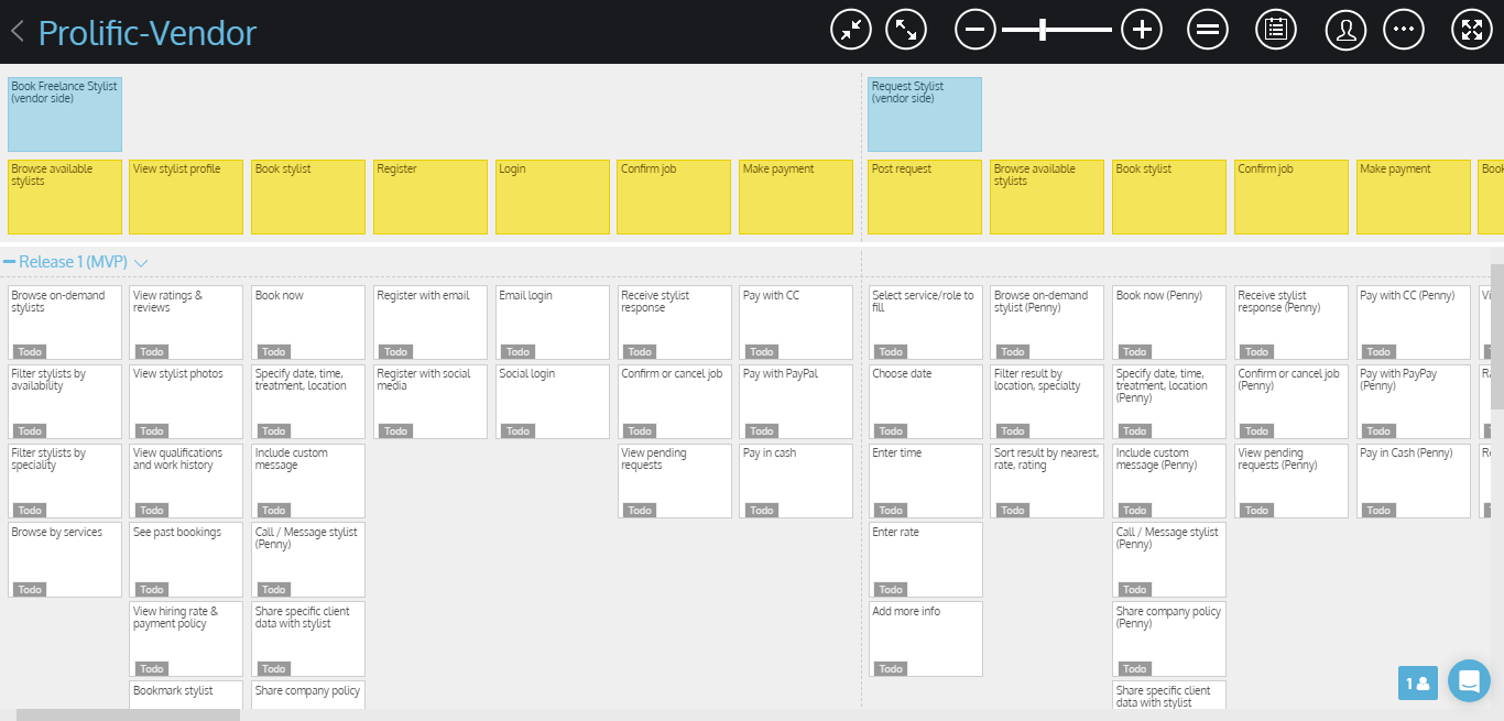
Furthermore, we drafted different scenarios for the personas in order to understand possible work flows and context of use to reach major goals, while at the same time developed user journeys to capture potential issues for every use case. Having done this, I conducted another whiteboarding workshop with the team to create story maps that would lay out the work flows. I took this activity a step further with the team by onboarding them on StoriesonBoard.com, a useful online tool for collaborative story-mapping, as the need for space and flexibility grew.
The digital tool saved us time and space compared to the conventional method. Also by working collaboratively anywhere and anytime, it allowed us mobility and the flexibility to easily revisit any work flow for revisions without the physical location constraint. The story map technique proved useful for ideation as we based our objectives on the goals (row 1), steps (row 2) and tasks (row 3+) laid out for the workflows.
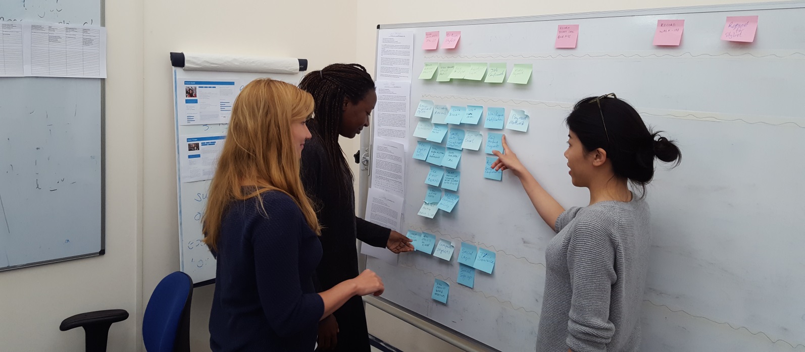
I organised and coordinated different ideation sessions with the team by applying double barrel methods of brainstorming and brainwriting followed with design studio and brainstorming for optimal creativity in suggesting, exploring, refining and communicating ideas.
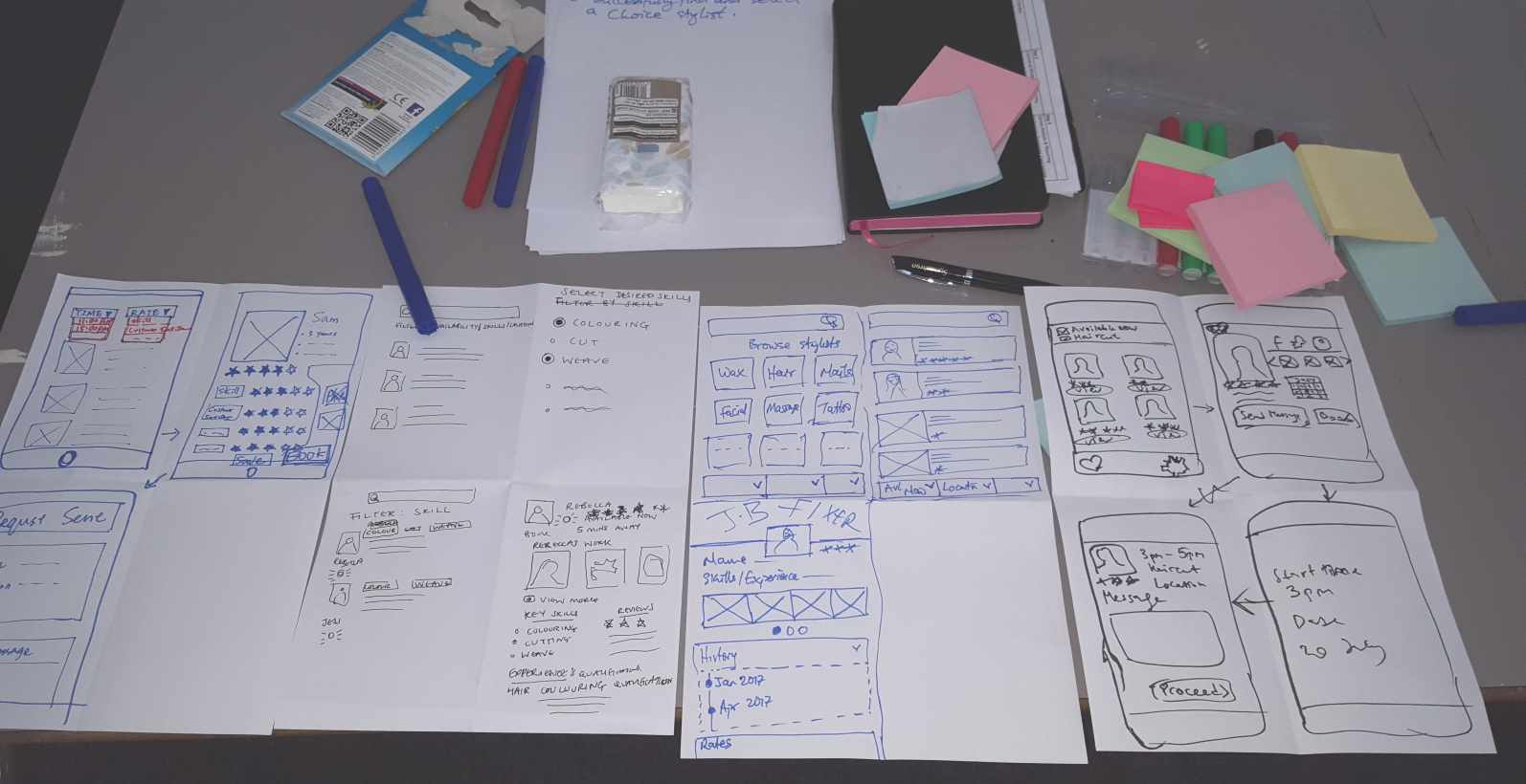
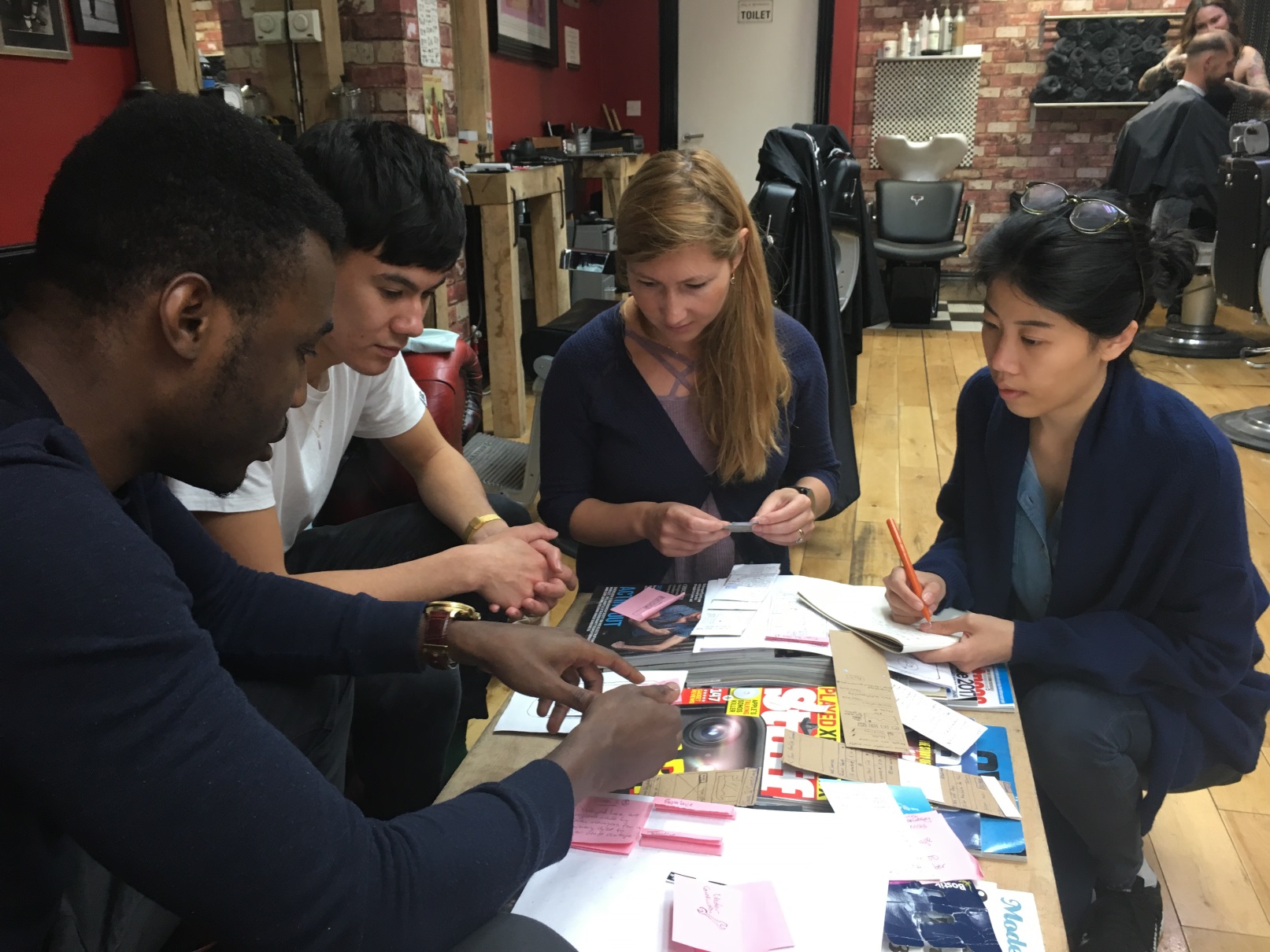
The ideation process took us through iterative stages of sketching and paper prototyping with the vendor-users to ensure that we were designing a product that actually solves their needs. We used both Victor (the independent stylist) and Victoria (the salon manager) personas to recruit participants. The feedback obtained from them enabled us to refine our sketches.
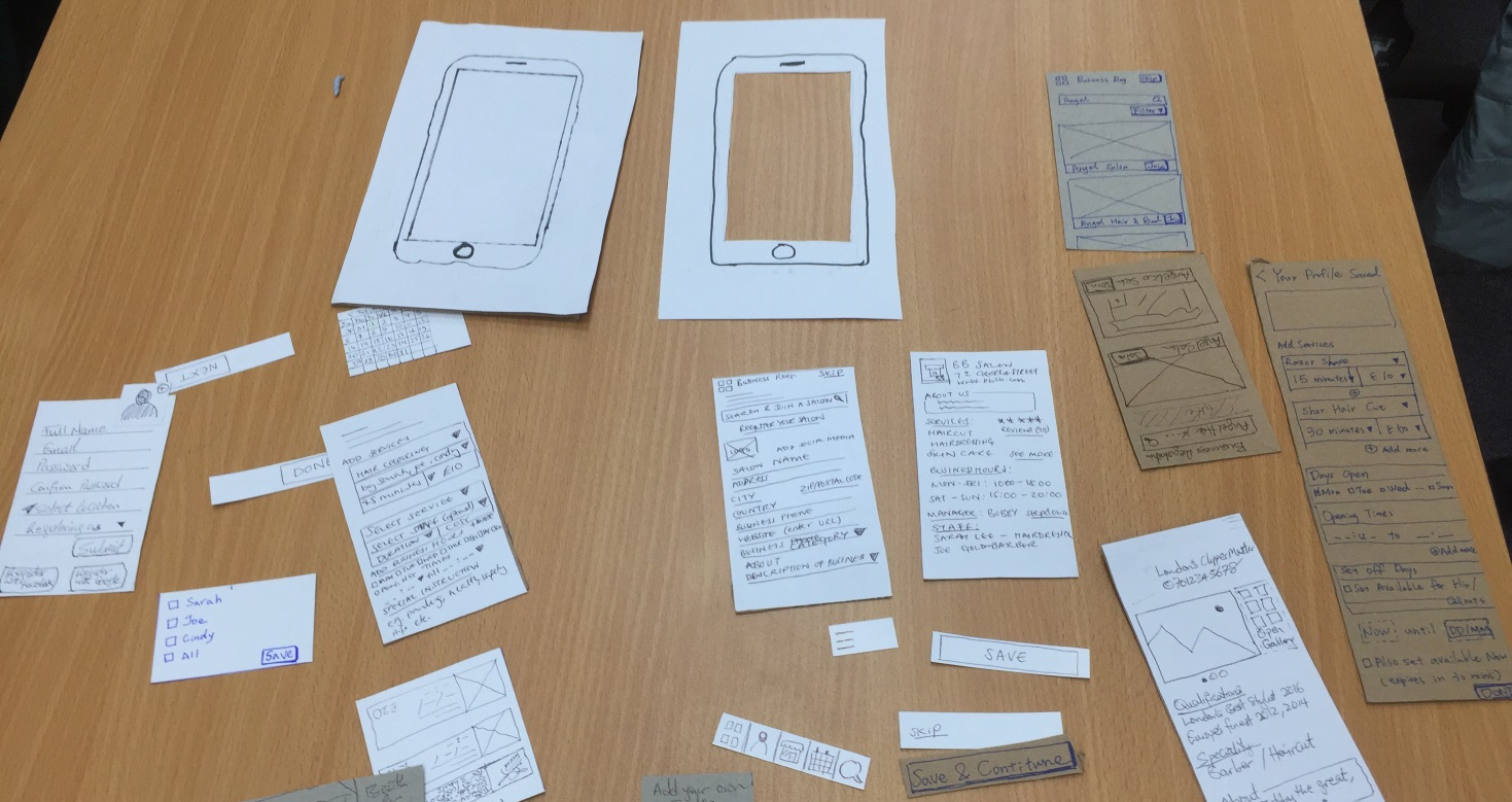
We used Balsamiq for wireframing by going from sketches to creating a higher, yet low fidelity interface layouts. Not only did we use wireframes to communicate ideas with internal stakeholders, I also used them to present designs to the project client in a more concrete way by focusing on design structure and interaction without going into detail on aesthetics.
The early feedback we got from the sketches and rapid prototyping informed and guided our design the cheapest and fastest possible means. It helped the team to become less attached to their ideas and creations but more open to modifying, adapting or eliminating some of them as required. Also, wireframing allowed us to easily capture possible navigations between interfaces that would be necessary to demonstrate in successive richer prototypes.
As at the time of documenting this case study, we've commenced with the visual design using Adobe Photoshop and we intend to simulate the produced mockups with Invision, then conduct more usability testing sessions with representative participants of both user groups. The Sketch app is also being tried and tested by the Mac users in the team for evaluative purpose only.
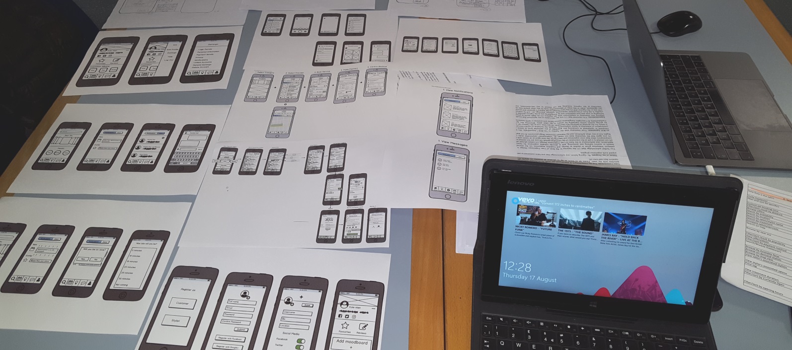
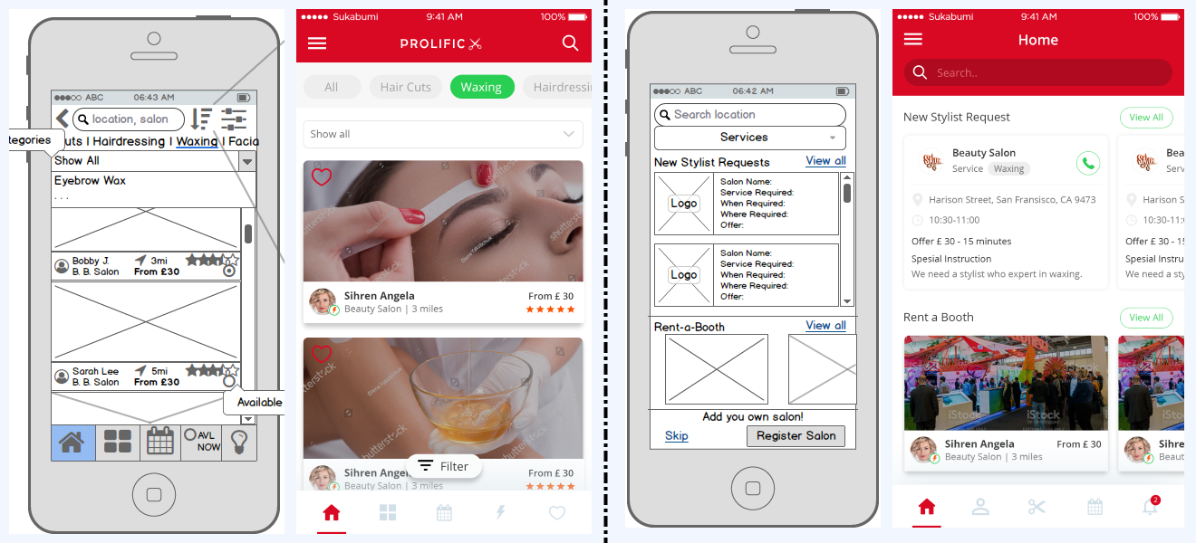
All the wireframes have been successfully reproduced into polished pixel-perfect mockups with new adjustments made. I worked closely with the visual designer to achieve this by defining and sharing the UI spec with him alongside the wireframes and other relevant design artifacts not initially available to him so that he understands the end-to-end user experience of the product. Also, to encourage room for creativity, I gave the designer as much authority as required to modify any wireframe where necessary and with a practical backing for any decision. This helped by allowing the UX team optimise their work even further and to also identify new considerations worth validating. Equipped with the mockups, I could then simulate a prototype using InvisionApp for further testing.
The following image represents some of the outcome of the low-high fidelity design process.
I had several meetings with the project client to explore and obtain new requirements, so by understanding their branding needs such as the urgency of having marketing materials prepared early on, I went ahead to sketch different logo variations, flyer and banner design. Once the client made his selection, I went ahead to oversee the polished design by a graphic designer. The finished design left the client very pleased.
The product landing page developed by myself is situated at www.prolific-x.com. Thanks for reading!
Discovery - Design - Prototype - Test

Status: Beta launch
Team: Agile focused, multidisciplinary team of 8
Standards: GDS, GDPR, HackIT Manifesto
I had the opportunity to work at London Borough of Hackney as a UX Researcher and it exposed me to different projects including two product designs and one service design. My contribution to the product design projects involved research and interaction design for a new digital alternative (My Property Account responsive app) to meet the needs of Hackney leaseholders; and for another product (Manage a Tenancy app optimised for tablet) to aid estate officers and area managers to serve Hackney tenants in more efficient and effective ways. The service design program involved designing a digital support blueprint to improve starters' experience through induction, but first understanding staff needs across their journeys.
I worked in a multidisciplinary agile focused team of 8 and I was actively involved in planning and designing research strategies, facilitating, analysing, reporting feedback and insights, as well as generating actionable recommendations to inform the design direction of both products. I engaged in quantitative and qualitative research and applied evaluative and generative methods. The studies I carried out involved, but not limited to user interviews, focus groups, contextual inquiries, card sorting and journey mapping workshops. My team and I iteratively designed, prototyped, tested, validated and discarded ideas to ensure we deliver a useful and usable product for the end users.
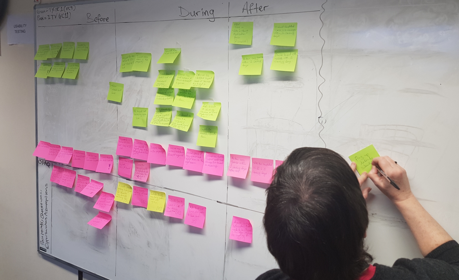
The research findings and insights I acquired enabled me to create purposeful artefacts to aid communication with stakeholders, likewise help my team and key stakeholders empathise with the users better. I adhered to the principles of design thinking, worked with organisational procedures and industry standards. One of the activities of doing so include conducting local government digital services (GDS) assessments for both products at critical milestones/release phase following discovery, design, development and testing. We also ensured strict compliance to the new data protection act (GDPR) by processing, sharing and storing peoples data in line with regulations.
Each project was as interesting as the other but for the sake of space and brevity, this case study is focused on the Manage a Tenancy app project.
Hackney's vision is to build digital products that will enable Housing Officers provide information, advice and services to tenants and leaseholders. Hackney Council already meets many of its residents' needs online but there exists questions and requests from tenants and leaseholders where digital services have yet to be created. The Neighborhood Services on the other hand is challenged with an integrated but outdated housing management system called Universal Housing. The system coupled with several inefficient paper-based processes yield poor data quality and don't support self-service or mobile working. Thus the justification for new digital solutions to propel the council towards a new organisational restructure as part of a wider modernisation programme that will streamline the way Housing Services operates, delegate more authority to front line staff and provide clearer lines of accountability comes to light.
Some of the opportunity gaps, later identified as business needs following preliminary research include, through better use of technology, :
Kicking off further discovery work to understand the business and user needs better, I first identified the project key stakeholders, had meetings with them, then followed up with 1-1 interviews with the product owner and the business team to clearly capture business requirements. At this point, I had gained fundamental knowledge of the neighbourhood housing workflows, priorities for a minimum viable product (MVP) and who the intended users would be. I soon after reinforced my findings with secondary research on related studies carried out by the previous research teams. This gave me a launch pad for my mission.
To understand the users and empathise with them better, I arranged three focused group sessions across 3 different neighborhood offices, each with an average group size of 7 participants - involving team leaders and estate officers per session. The discussions opened up to me known and new user needs, goals, motivations, frustrations and concerns. The captured user needs spanned across efficiency, technical, usability, communication and system availability issues.
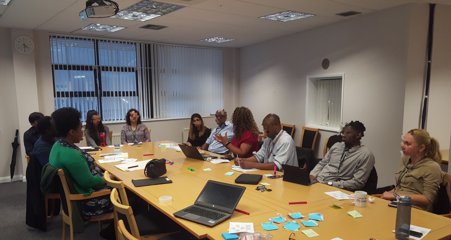
Some of the high level themes generated from my analysis revealed that:
This wasn't enough, I needed to align what users say to what they actually do. Besides, the need to obtain richer, unrestrained feedback following the focused groups inspired a further study where no group think or team leader influence would exist, so 3 contextual inquiries with the officers i.e. 2 desk-based and 1 field-based were conducted to clearly understand how the officers use the current inefficient system, capture their pains and to probe them when necessary as I observe them conduct certain tasks. Not only did these various meetings expose me to fresh insights, I could also validate preconceived notions originating from self and the business team. Moreover, I formulated a mental model of the users early on to inspire draft personae of the users. I then arranged a combined user stories and empathy mapping workshop with 10 participants to collect and classify stories and epics for selected services, and to capture user thoughts and experiences through their journeys.
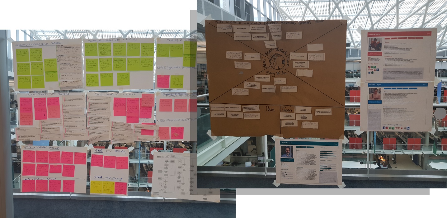
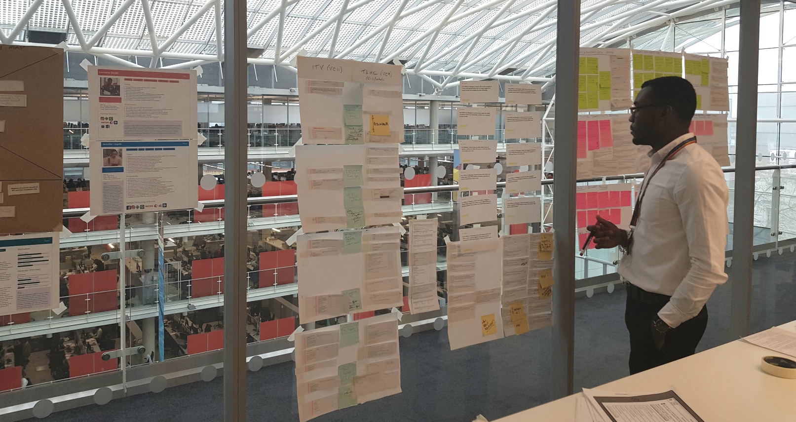
I regularly fed back to the stakeholders including the product team and business team with the aid of visual presentations using G-Suite products such as Google Slides at show-n-tells and online sharing. Some of the generated artefacts that aided this process and informed the design direction include primary personae of the Estate Officer and Team Leader each, empathy map and an epic board.
Equipped with adequate research findings and insights, the product owner could then effectively prioritise user stories for backlog creation on Jira, as well as provide clarity on the MVP requirements. The product team including myself often collaborated with the product owner to update the backlog and generate a new sprint bucket list every fortnight following sprint shipment.
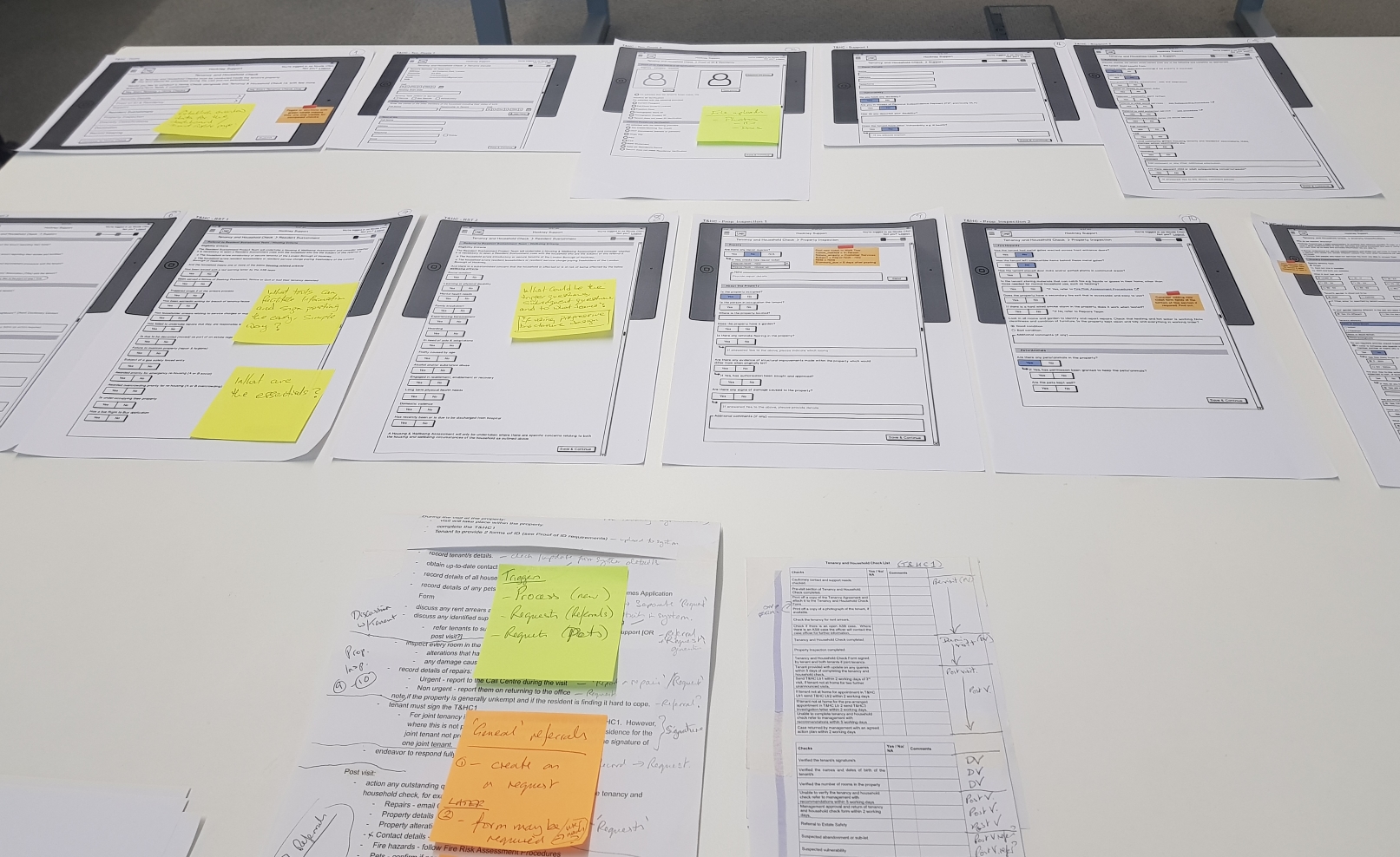
A skilful illustrator, I often conceptualised ideas with stakeholders using the old, quick method of sketching to rapidly seek early feedback before expending more effort into design work. I usually followed this process with wireframe design using Balsamiq. The wireframes enabled better visualisation of design ideas for evaluation with the product owner and ensure conformity to standards. Designs usually shipped from lo-fi wireframes to coded interactive prototypes by the developers on Outsystems - a low code, robust platform widely utilised in the organisation. I would then arrange and facilitate user testing sessions alongside a co-researcher to gather user feedback, assess the level of usability achieved thus far, identify constraints and iterate gradually till a more stable, useful and usable product is achieved. MarvelApp enabled my team to easily review prototypes, and annotate comments for more iterations.
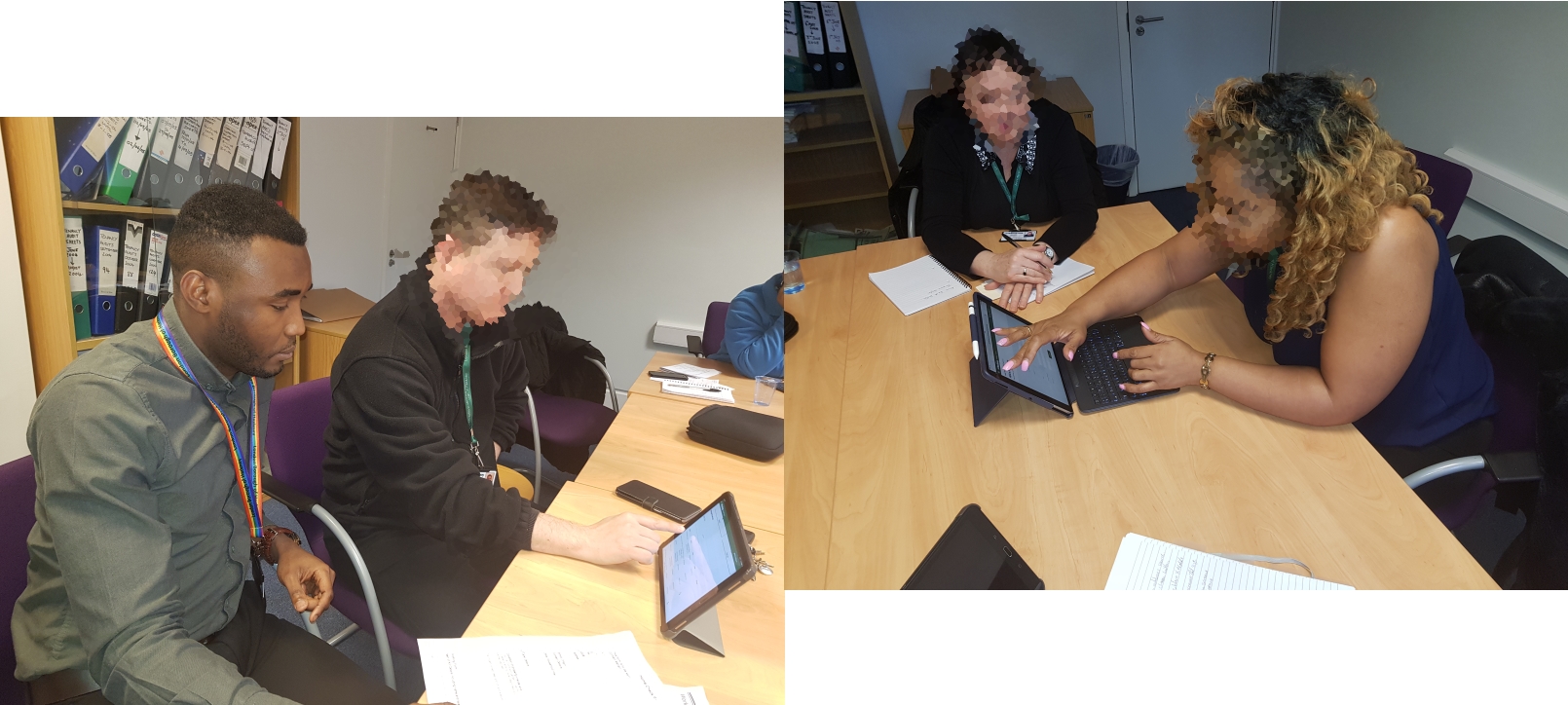
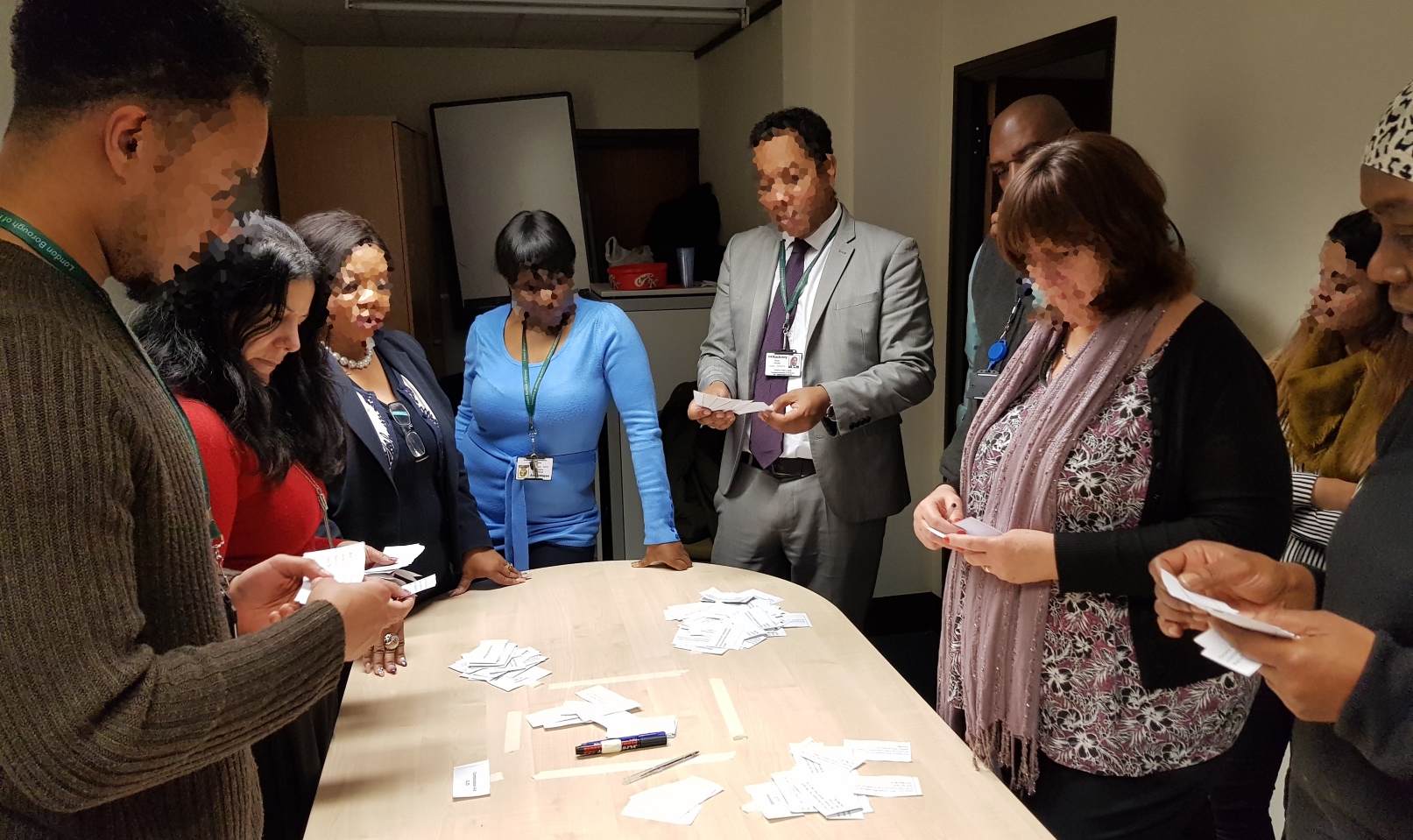
Designing the Tenancy Audit and Home Check work flows involved the above process together with two journey mapping sessions with estate officers for story boarding and one card sorting workshop to identify the affinity between datasets extracted from the old lengthy paper forms, their similarity and importance.
The problem statements (research questions) that inspired and guided the card sort study were:
The card sort workshop helped inform a better information architecture for an efficient navigation through the Tenancy Audit work flow. I particularly had the questionnaire re-arranged in logical flow that is friendly to the use from their identification and classification of form items in groups in the sense that they can be probed (should ask), observed (should see), and fetched (should have).
The product beta version (MVP) which includes a Hub to create and report incidents was successfully launched in pilot phase at one of the neighbourhood offices with selected officers for an initial 2-month period as planned by the management to seek early feedback from real world use by real users. It was well received on the day of launch and the common feedback from the testing officers was that they found the app fast, simple and easy to use. The Tenancy Audit and Home Check design provided a framework to support additional neighborhood services processes.
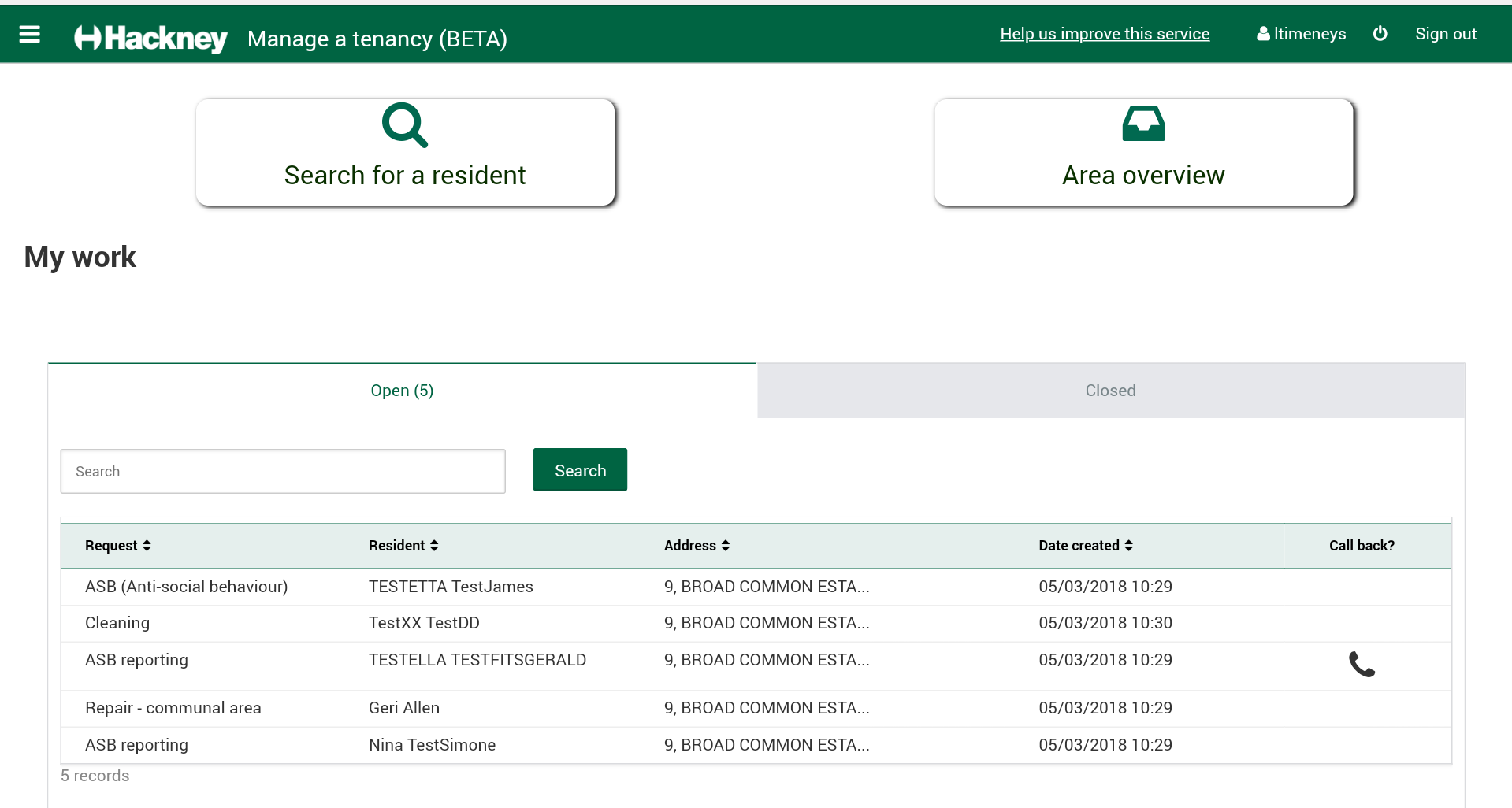
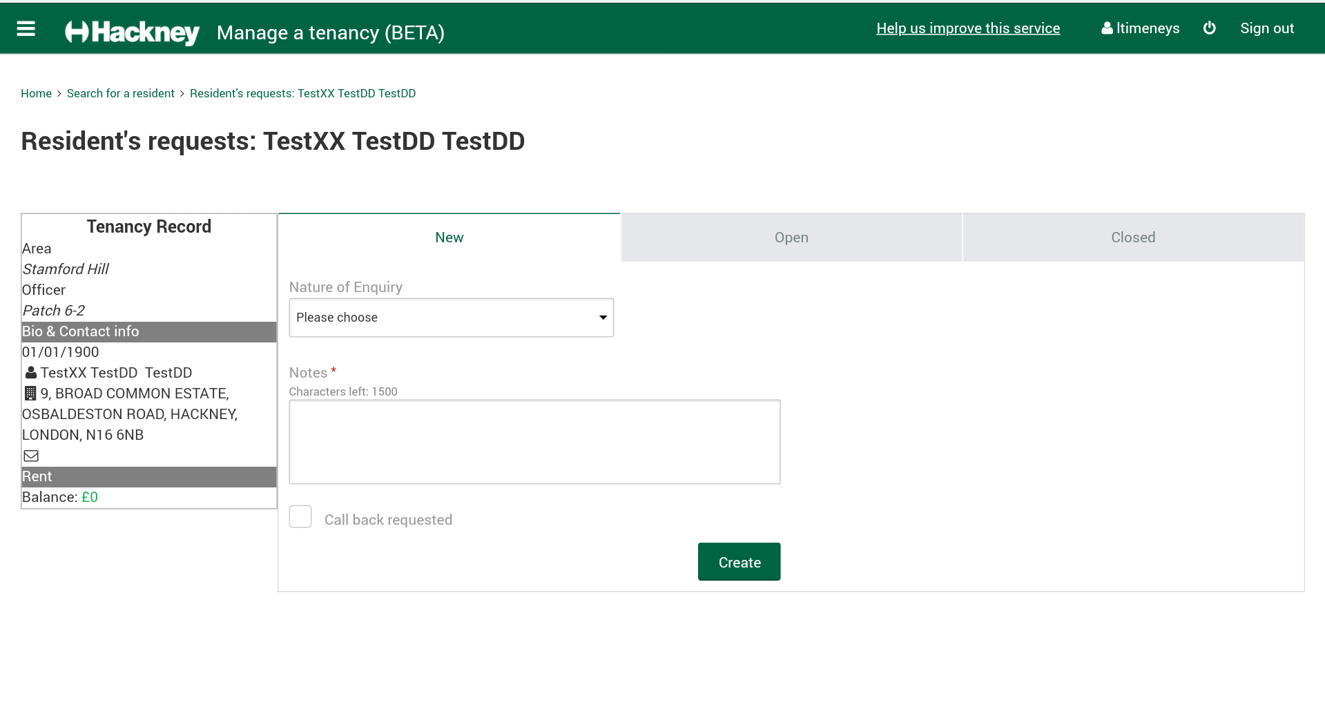
The GDS assessment passed 12 out of 15 points as my team understood user needs, we used agile methodology, we iterated and improved regularly, we evaluated user data and ensured no breach of the data protection act, we used open standards and wrote re-usable APIs to it, we tested the end-to-end service in an environment similar to that of the live version, we made sure the user succeeds the first time, we built a consistent user experience, identified performance indicators and planned for ongoing user research.
The GDS report is published here. Thanks for reading!
